Pod Point
Pod Point is a leading UK provider of charging infrastructure for electric vehicles. It provides charging units for home, business and public use.
My main role as Lead UX/UI designer here at Pod Point is to maintain the existing products, like the Pod Point App and services while working on new features and creating the products that are going to shape the future of the company.
As electric vehicles keep rising in popularity, so is demand for charging infrastructure and our products, which always offer a challenging experience when researching how to shape the future of a fairly new industry.
Talking and listening to user needs and feedback has been key in the creation and development of new products, while balancing the current industry tech limitations and expanding styling and brand guidelines.
Everyday working at Pod Point has been a full dive into an ever changing industry that still has a lot of complexities with a steep learning curve.
I have been working across multiple departments and products at Pod Point, all of which needed a different approach depending on the goals.
Research methodologies
At Pod Point, I had the opportunity to explore and innovate various research methodologies, though occasionally constrained by time limitations, which sometimes impeded conducting thorough investigations. Despite these challenges, I actively engaged in testing and refining novel methodologies. In certain instances, we had to rely on existing data or assumptions, which raised concerns about whether our approach would be optimal for our end users. When time constraints were pressing, we
conducted internal testing, leveraging the diverse pool of over 500 employees with varying backgrounds and user profiles. However, I occasionally felt dissatisfied with this approach as it might have led us to overlook crucial aspects.
To enhance our research processes, we integrated several tools into our methodology, such as Hotjar, Usability Hub, and Mixpanel. Hotjar enabled us to gather valuable insights into user behavior through heatmaps, session recordings, and feedback polls. This tool provided a deeper understanding of how users interacted with our products and identified pain points.
Usability Hub allowed us to conduct remote usability tests and gather feedback from a broader audience, which expanded our reach and enabled us to identify potential issues that might have gone unnoticed otherwise.
Mixpanel, on the other hand, helped us track user engagement and measure the impact of changes in our designs or features, providing valuable data to inform decision-making. By incorporating these tools into our research process, we aimed to enrich the quality of our findings and address time constraints more efficiently
Design System
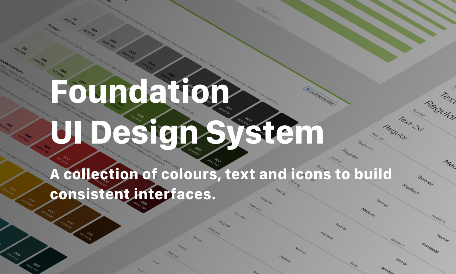
When I first started at Pod Point in 2020, I noticed that the non-existent design system and outdated brand guidelines were affecting our ability to deliver a cohesive user experience. The lack of a unified design language led to inconsistencies across our suite of products, making it challenging for users to navigate and engage with our offerings effectively.
To address these issues, I undertook the task of creating a comprehensive design system from scratch. My goal was to establish a solid foundation that would serve as a guiding framework for all product development efforts. By implementing a design system, we aimed to bring clarity, consistency, and coherence to our product ecosystem, ultimately enhancing the overall user experience.
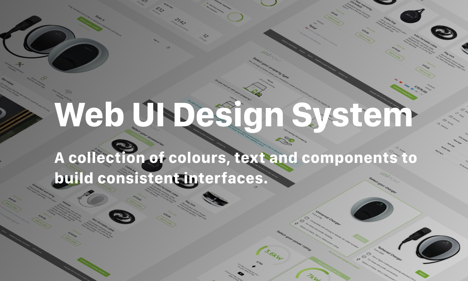
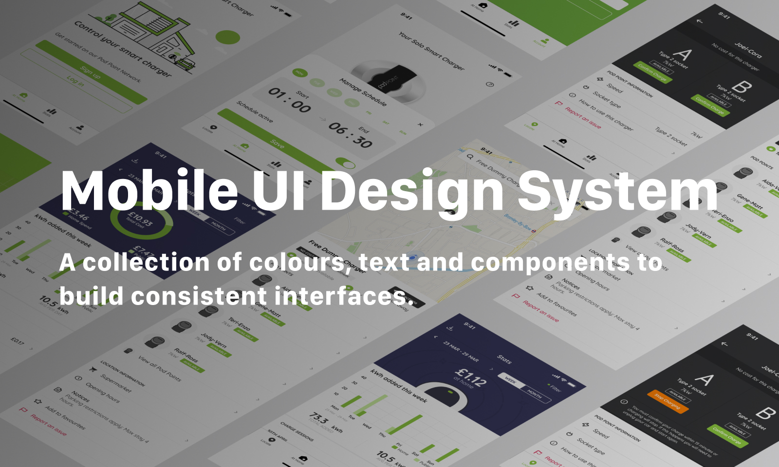
The design system initiative involved three key components: a foundation system, including colours, spacing, typography etc and one for web applications and another specifically tailored for mobile platforms. Recognizing the unique design considerations and user interactions associated with each platform, I ensured that the design systems were optimized to suit the respective environments while maintaining overarching brand coherence.
Pod Point App
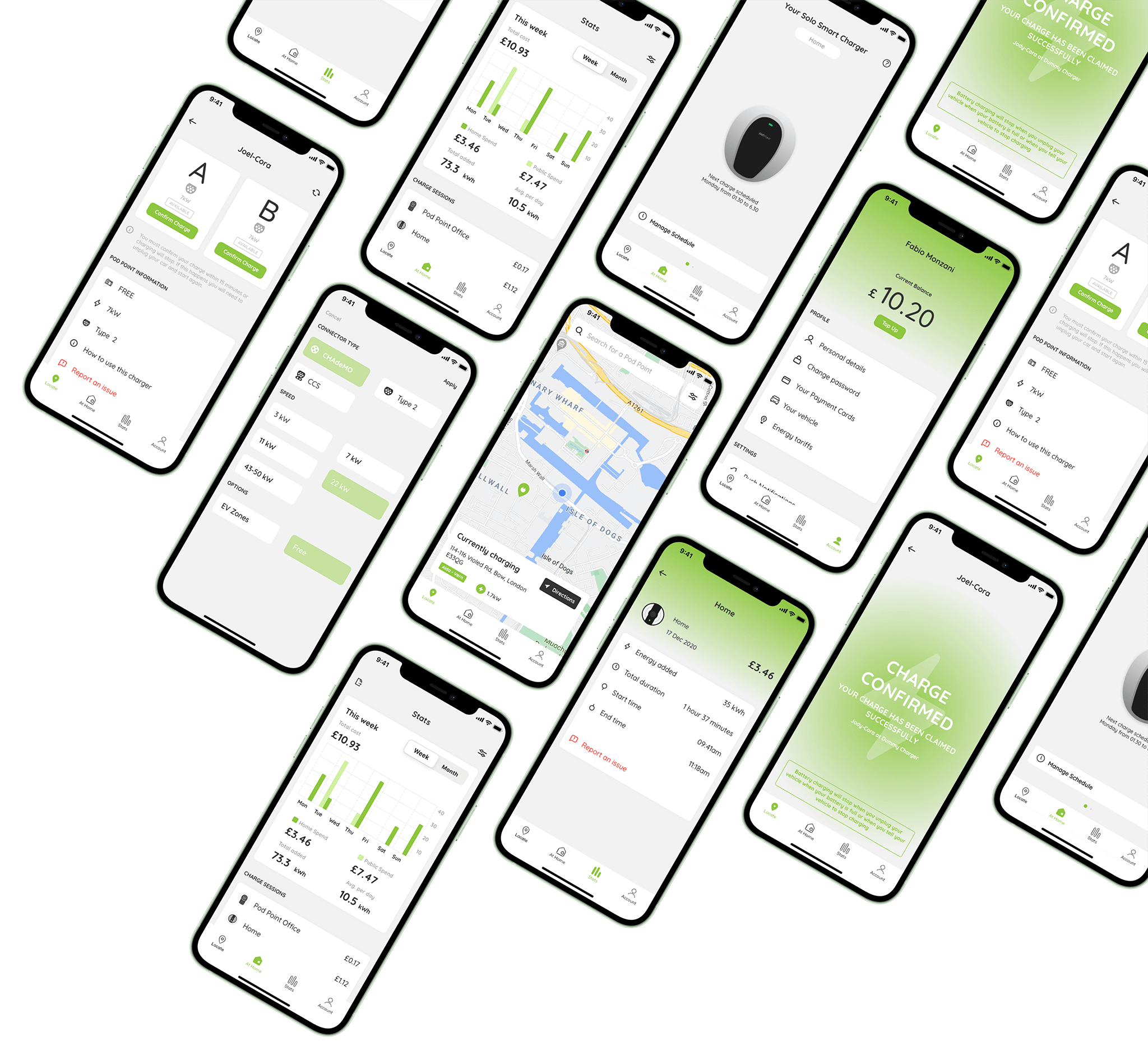
The Pod Point App is the heart of the home charge ecosystem.
From here you can explore and access the public charging network as well as managing your WiFi enabled homecharger and your charging data.
EV drivers have a particularly wide range of user persona that tend to condense in the range of 40+.
It was imperative to create a simple user experience that would benefit from consolidated design patterns that are easily recognisable.
Researches for all Pod Point products were carried out both internally and externally, tapping in our ever-growing customer base.
Design sprints were also used to kickstart new products and features but following a new redesigned structure to better fit the “working from home” environment.
 Charge schedule
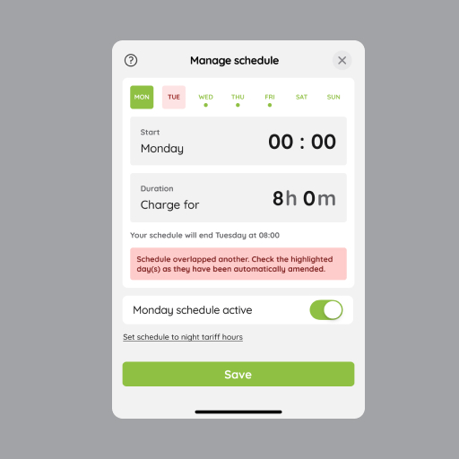
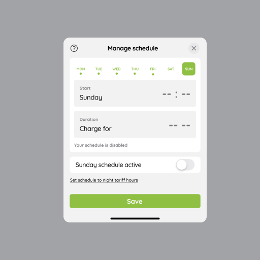
Charge schedule was one of the first feature I have been working on the EV driver app and one that has been requested by our user for a very long time. The feature allowed user to schedule a start and stop time to charge their EV when electricity was cheap at night, especially if you had a dual-rate tariff. This project and initial release had to overcome some technical difficulties due to the charger API and the general infrastructure limitations and was released in 2020. Due to limitations we were constrained to one schedule per day, schedules could not overlap meaning that we had to develop a sigular approach for a very simple feature.
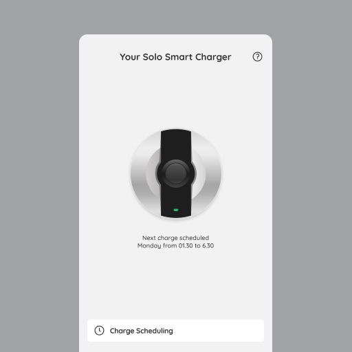
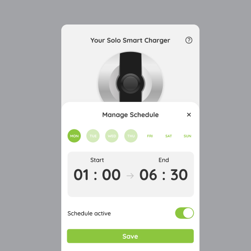
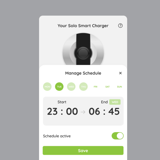
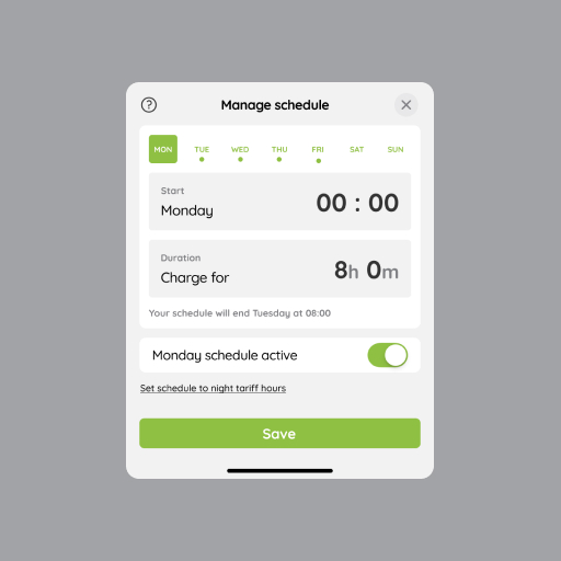
The next release of charge schedule (2023) improved upon the previous iteration bringing more clarity around time settings and some other needed improvement suggested by our users. Among the improvements we decided to shift to a time based duration instead of selecting the start and stop time, also the days of the week are now clearer to understand where a charge is active or inactive.
 Charges expenses for companies
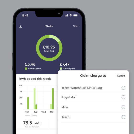
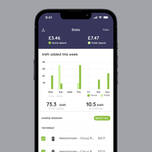
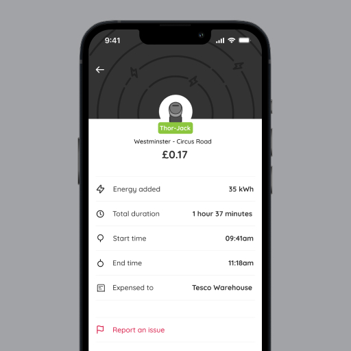
As part of the new Sites Management Service, business customers using the Pod Point public network needed a way to expense their charges to the company. Before implementing this feature, drivers had to downlaod a CSV file of their charges and send that to their company for refund. The expensing feature seamlessly integrate with the Site Management Service, so that fleet managers can see charges and expenses in realtime as well as refunding drivers.
 Onboarding journey
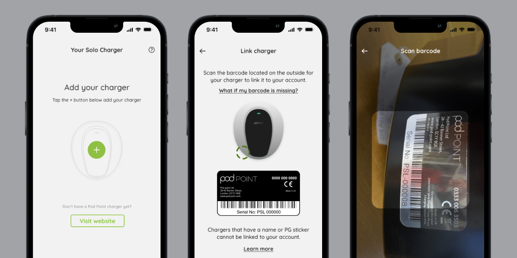
As our user base grows and Pod Point units are installed on new houses and developments we needed to develop a seamless in-app experience for new owners to connect their unit to the app in order to control, schedule and charge. Before implementing this journey in the app, the customer would have to contact customer support via phone if their unit was not purchased directly through Pod Point.

 CO2 Insights
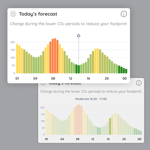
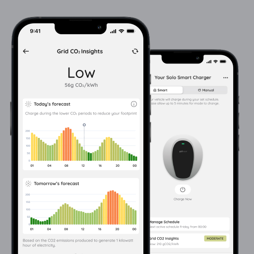
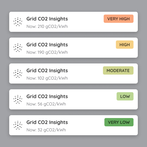
CO2 insights bring awareness to everyday user about the real impact of using electricty at specific time of the day. By using the National Grid API we were able to display the amount of CO2 generated per kWh produced, so that user could make and informed and conscious choice on when was best to charge their EV or use electricity in general based on their region.
Installer App
The Installer App, started in 2023 was a project initiated to replace the current installation and configuration methods of the units, usually performed by electricians and installers.
The goal was to create a more native and streamlined experience that could be accessed directly on the installers mobile devices instead of relying on a webpage living on the units and accessible only via captive portal.
In collaboration with ScreenMedia, an external agency tasked with the development of the mobile app for Android and iOS devices, I was responsible for creating the app user journeys, investigating installers and electrician preferences and translating that into a mobile app, as well as designing the full UI and general experience.
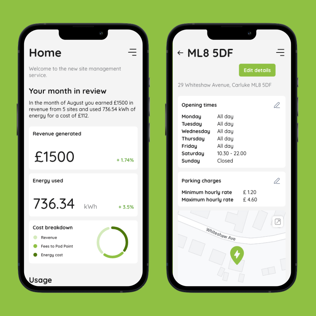
Sites Management Service
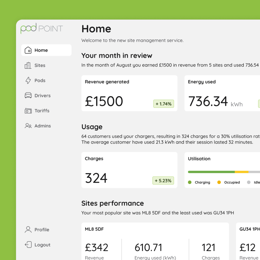
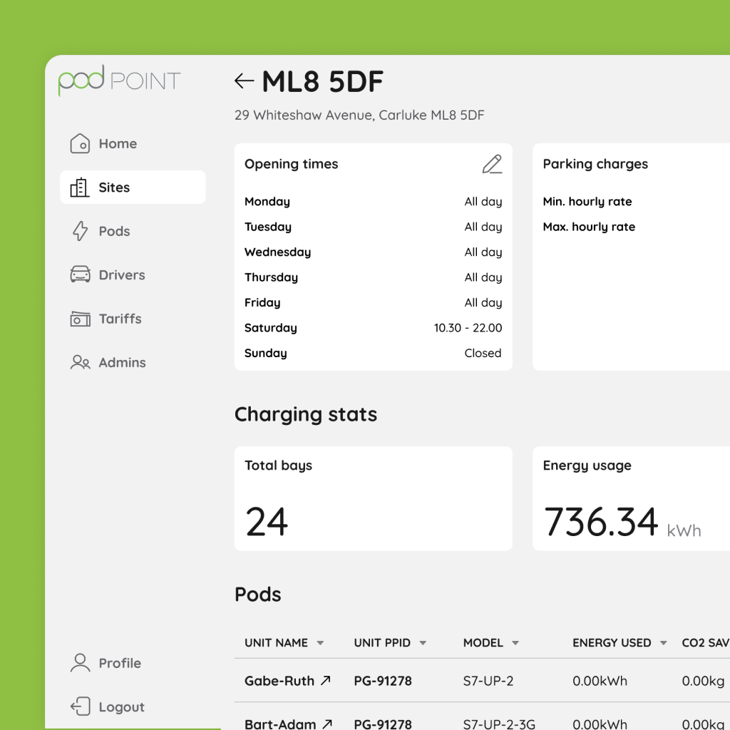
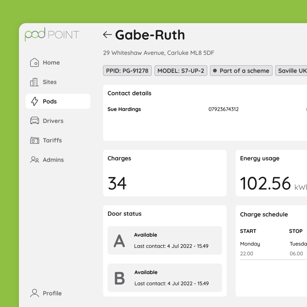
Offering a fleet management system has always been one of the main priority for the commercial side of the business as well as replacing our old management system.
Among our customers Mitie, DPD, Amazon and Sky to name a few, had the need to track usage and electricity expenses for their new EV fleet delivery vehicle.
We had to offer a solid solution that could help visualise multiple source of data as well as managing driver, vehicle and expenses.
Research and user interviews started well in advance in order to have enough time to better understand the problem we were going to solve but also creating a solution that could scale together with our customers fleet.
I had the opportunity to learn more about the needs and experiment with new ideas given how new the EV industry is. Lots of data needed to be managed in the process while displaying them in a simple and intuitive way was a key part of the success of our fleet solution. Once released to our business customers the product was well received and these are some of the feedback we received:
"Better and faster than the old system, and you guys are listening"
"The new portal is great and much easier to use, thank you for setting up access"
"Not complicated to use, the layout is much better"
"Great new site, very easy to use"
"It does seem a lot cleaner and more intuitive"
"Looks modern and contains lots more info"
Storefront experience
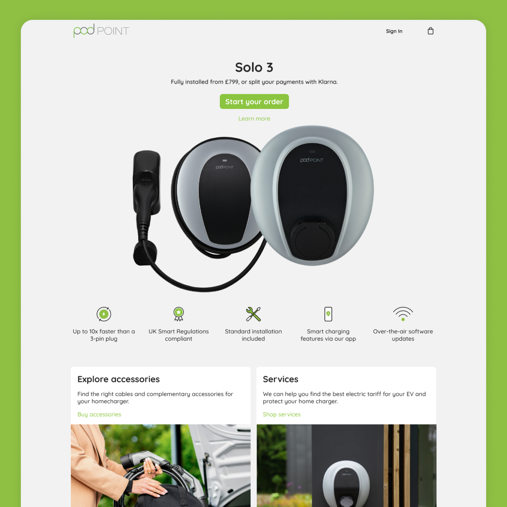
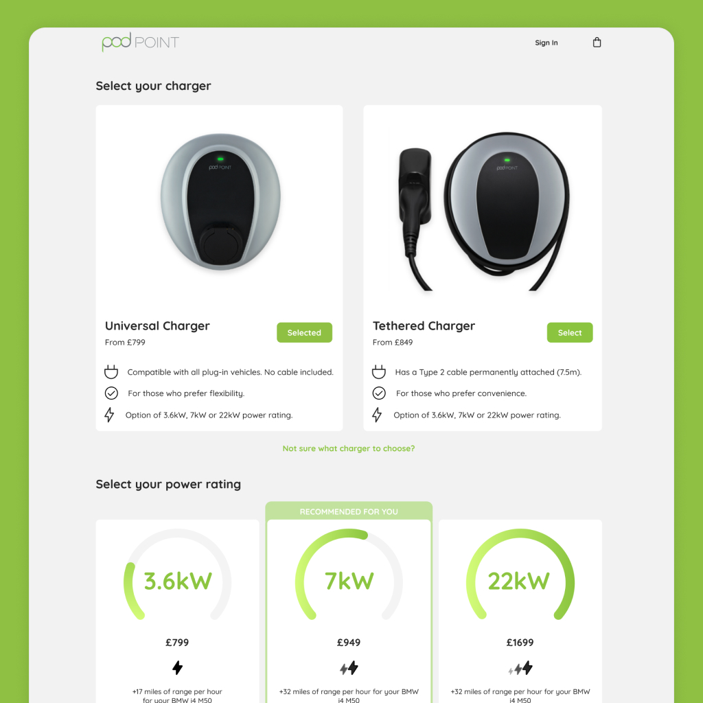
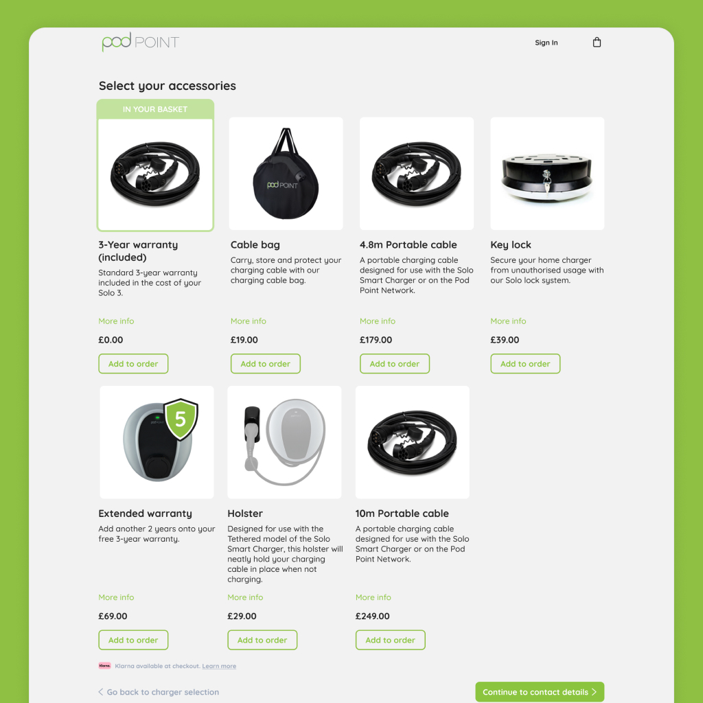
The homecharge storefront experience was the remake of our current e-commerce platform, allowing customers to purchase their homecharge units. As the business requirements were growing in complexity, our current e-commerce experience needed a redesign to accomodate for more products, acessories and streamline the experience to make it simpler for our customers to complete their journey. In the process of migrating to a CMS rather than a custom built platform we collaborated with an external agency to deliver the platform.
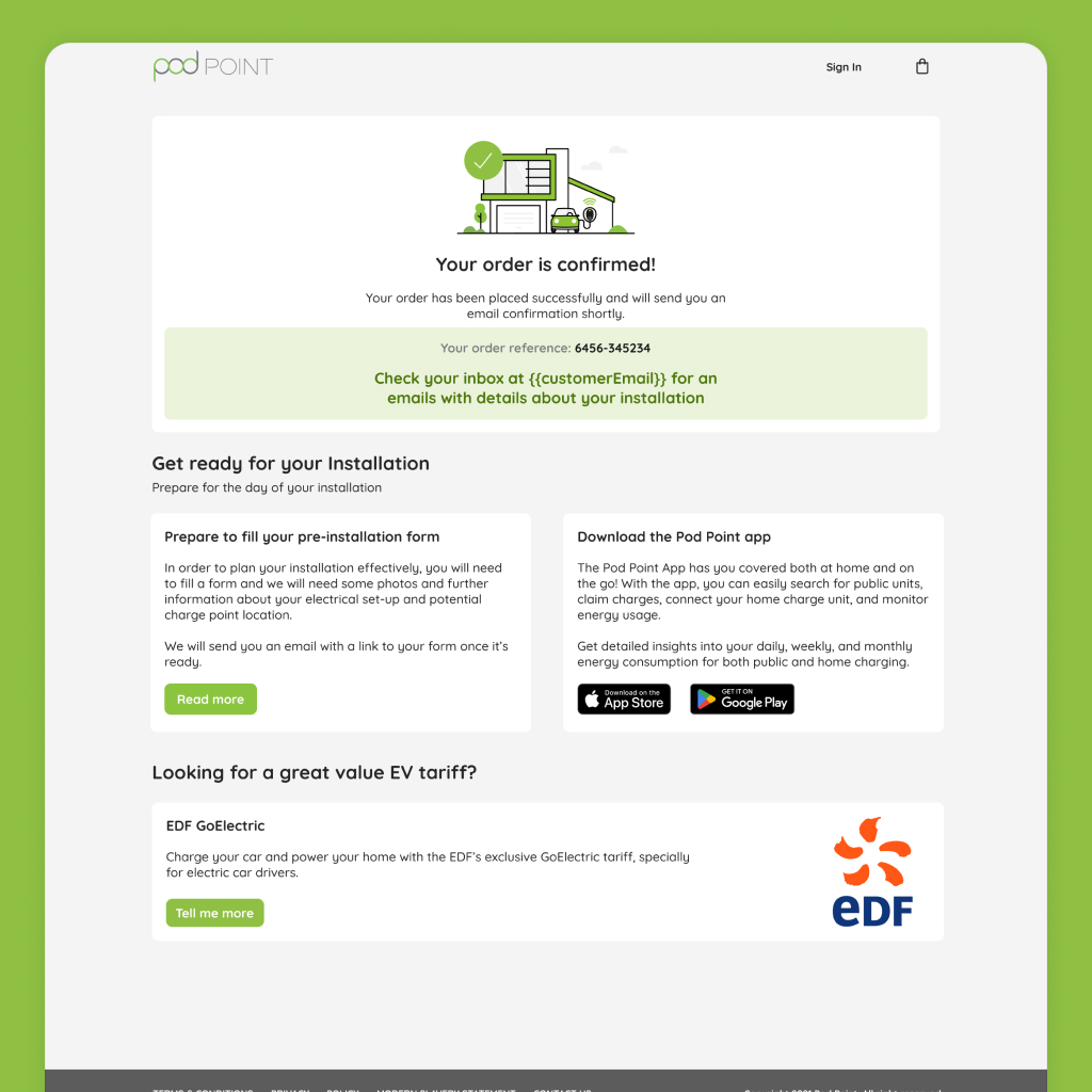
Other projects
Knowledge base
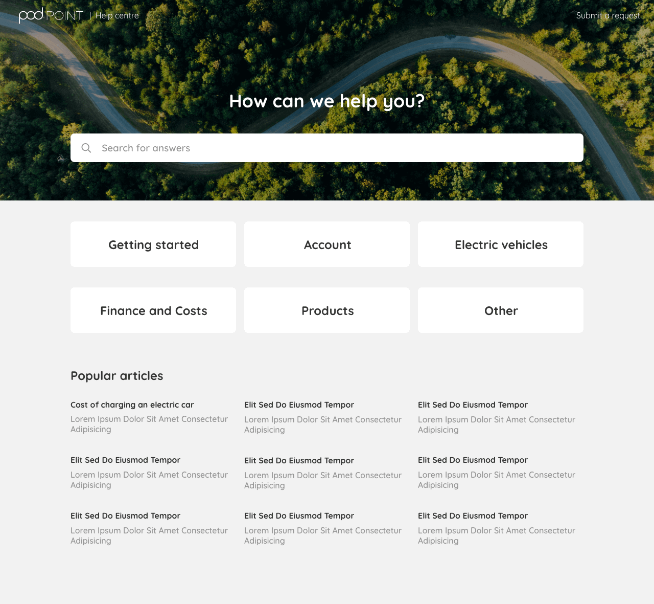
A Salesforce based knowledge base to help users find answers to their questions.
WiFi Access Point UI
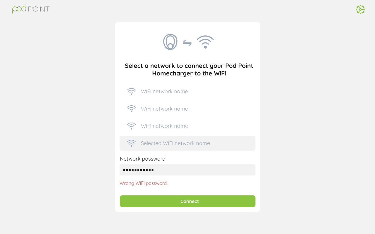
UI solution that required small size and interoperability living on the built-in memory of our homechargers to help installers and customers configure their unit.
Branding website
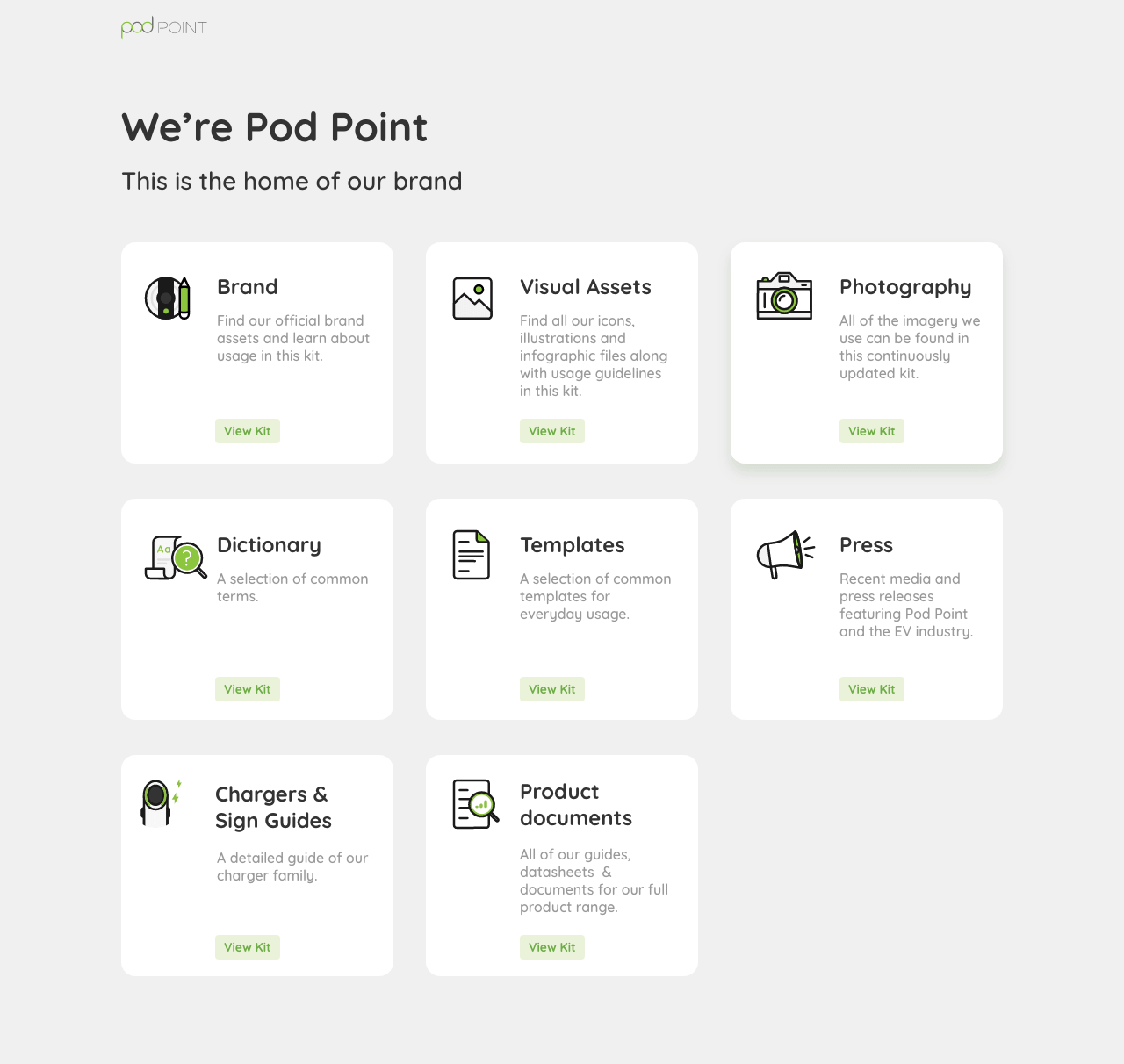
Branding subdomain available at brand.pod-point.com to document our brand guidelines and assets.
Pod Point 2020 - 2025
