LOKI.CODE
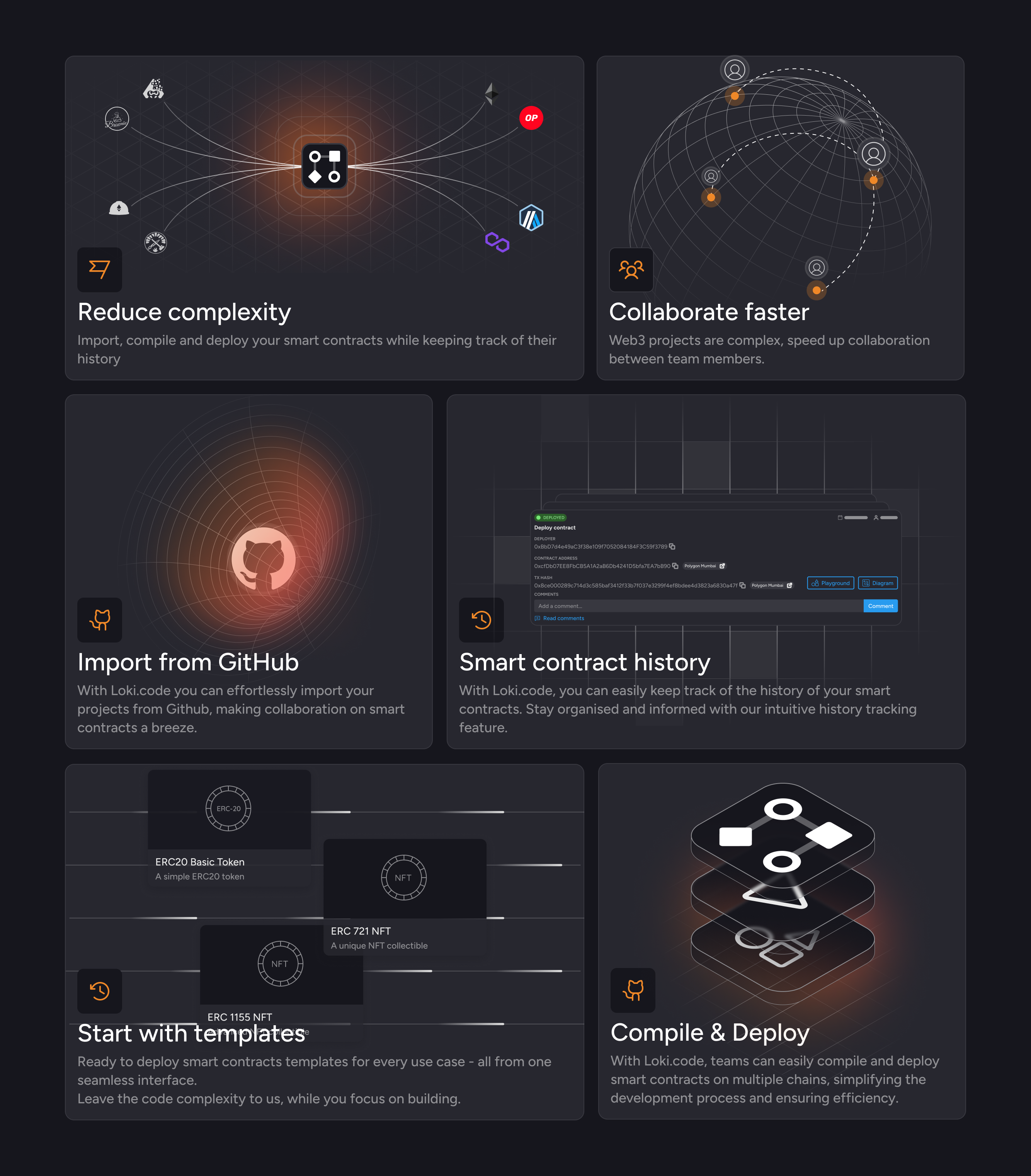
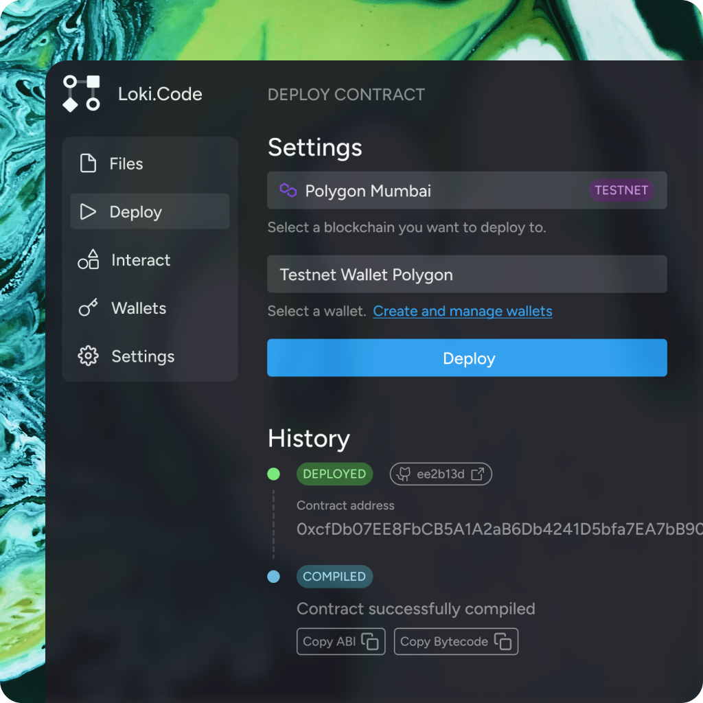
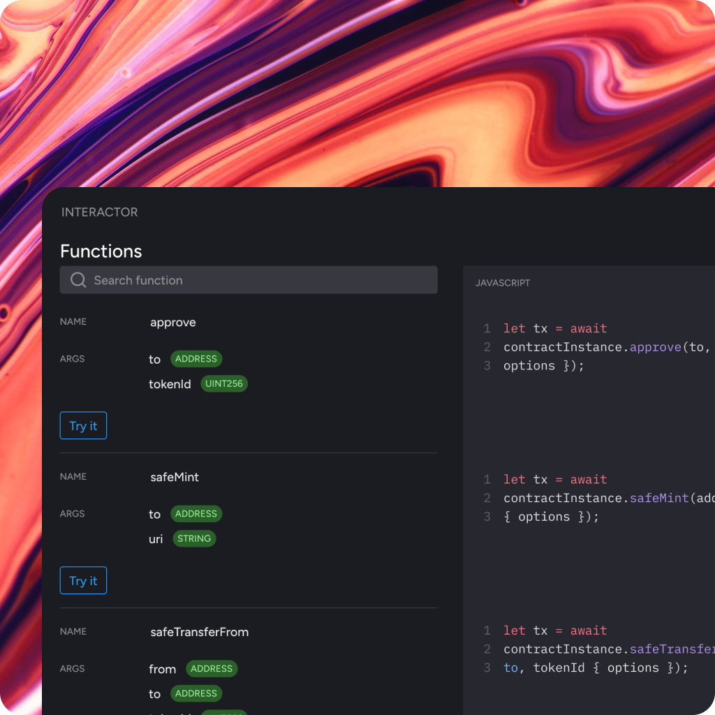
Loki.code is a DevOps platform for Web3 teams developing dApps to easily manage, compile, test, and deploy smart contracts. In the role of Leading Web3 UX/UI designer at Loki.code my main responsibilities are to bridge the technical understanding of Web3 and blockchain with simple designs in order to create a developer-oriented platform to onboard Web2 developers into Web3 but also offer a reliable product for seasoned and experienced Web3 developers. Loki.code was selected among hundreds of applicants to the Techstars Web3 accelerator exactly for these characteristics as we conitnue to grow our offering and product to decentralised teams.
The origin
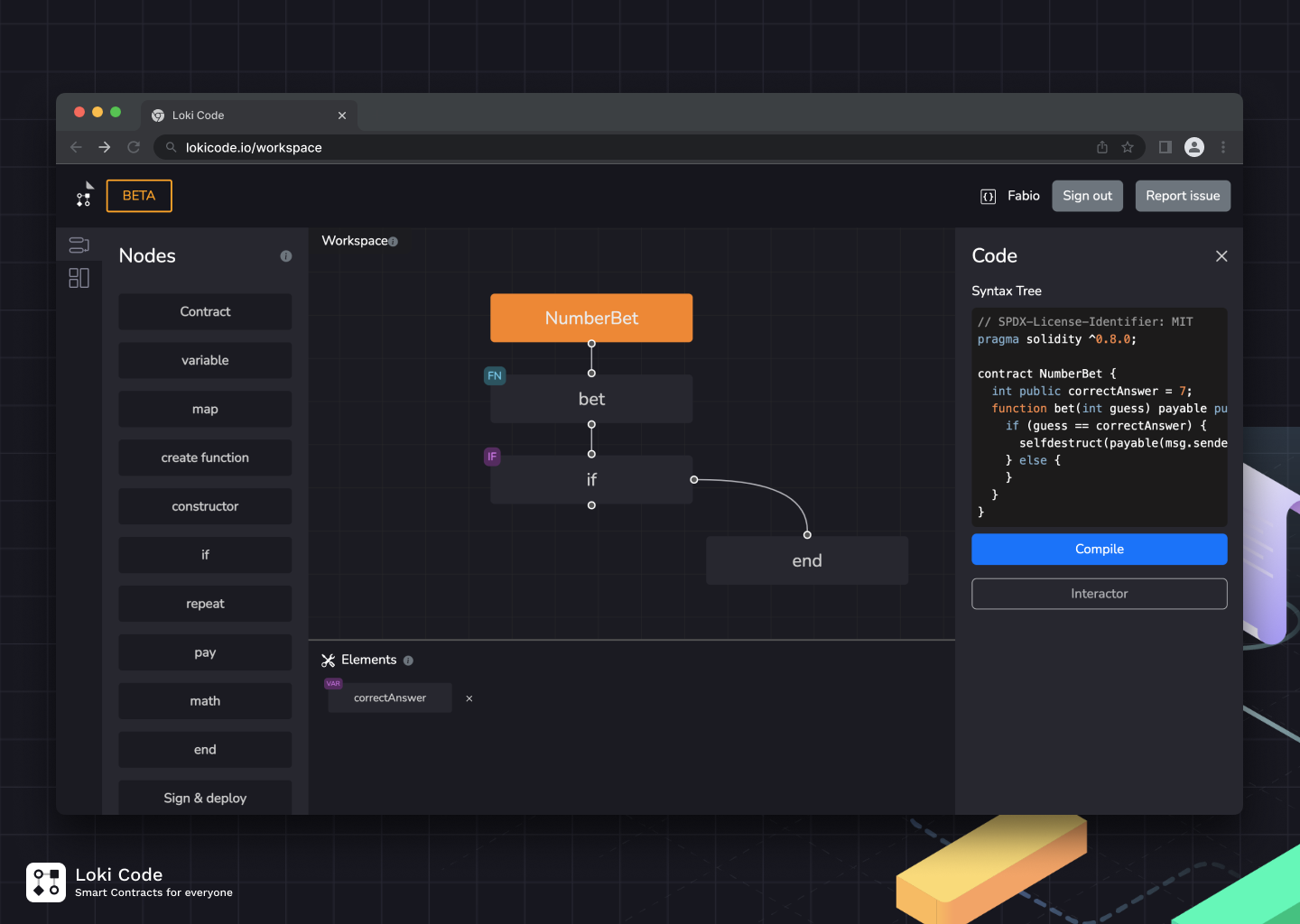
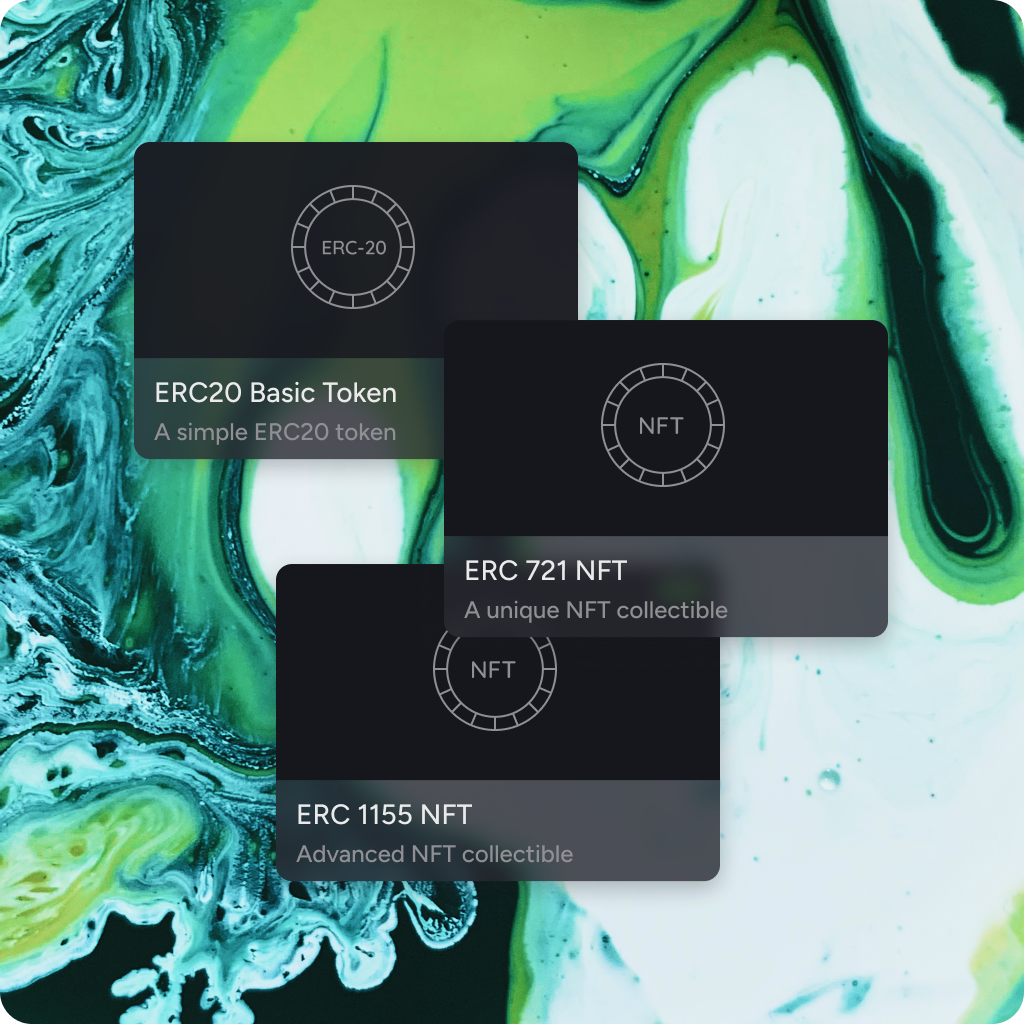
Loki.code initially debuts as a visual programming language for developing smart contracts in Solidity and oriented towards students and beginners entering the space.
Although technical complications, lack of market and interest was one of the reason why the company would later pivot to a more B2B product for managing the smart contract development lifecycle for teams and small companies.
Given my previous experience in developing and working on visual programming languagea at SAM Labs as well as deep knowledge in the Web3 space was something that made me a suitable candidate for the role.
User research
When developing a new product from scratch like Loki.code, differerent user research methodologies were implemented. Primarily this consisted in finding existing teams developing smart contracts and try to get a 1:1 interview to understand the pain they were currently experiencing with existing tools and solutions. In the beginning this worked out pretty well to get a better understading of the problem and where we could improve. Some developers were genuinely interested in what we were building and they wanted to remain in touch via chat/email to see if they could help further. This shifted the approach of user research to mainly be managed via Telegram groups and occasional online meetings to display some design options. The reason this was manageable was that we didn't have more than 20 chats, but scaling this approach could have been a nightmare if we had more participants. The result of this process was a clear understading of the problem which also led to the identification of different user personas and a list of possible features spanning across the MVP.
Design
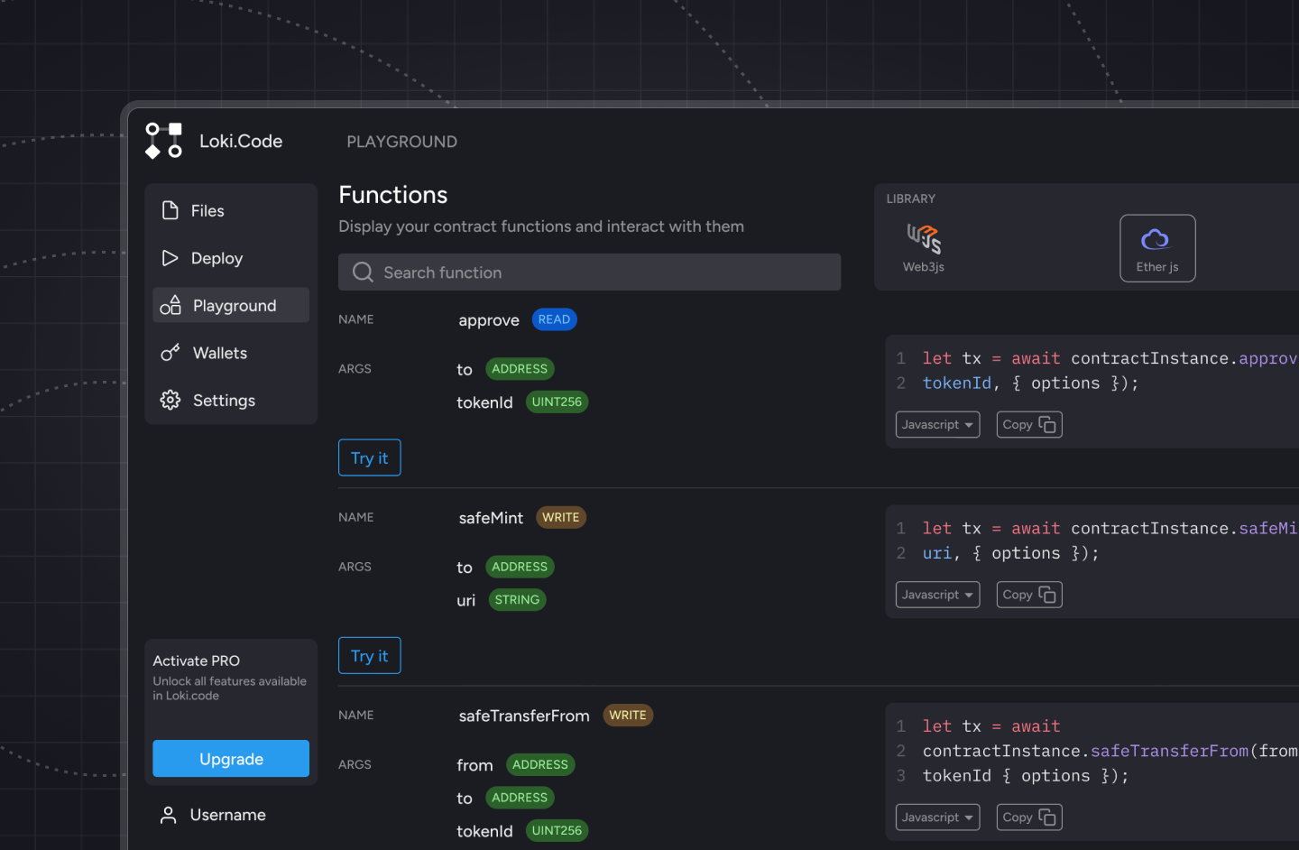
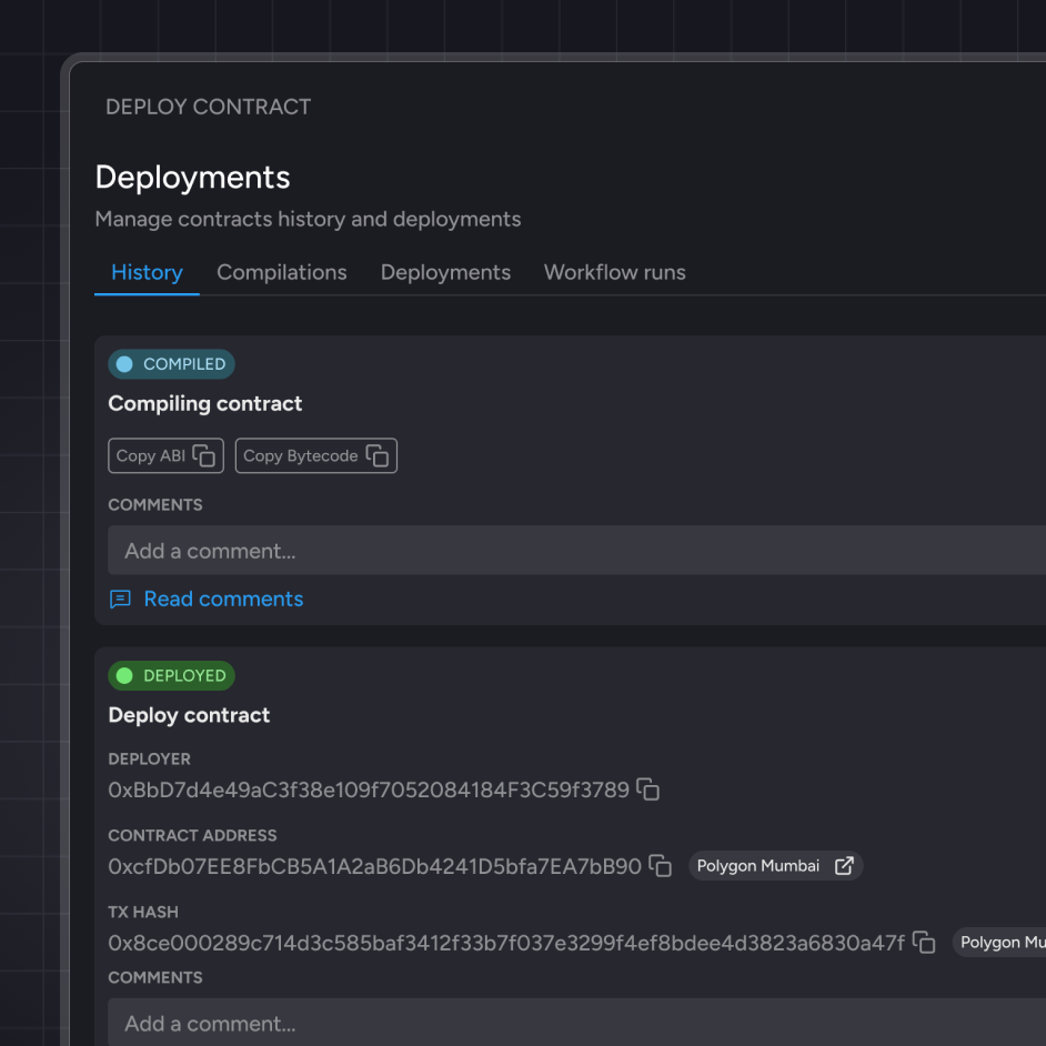
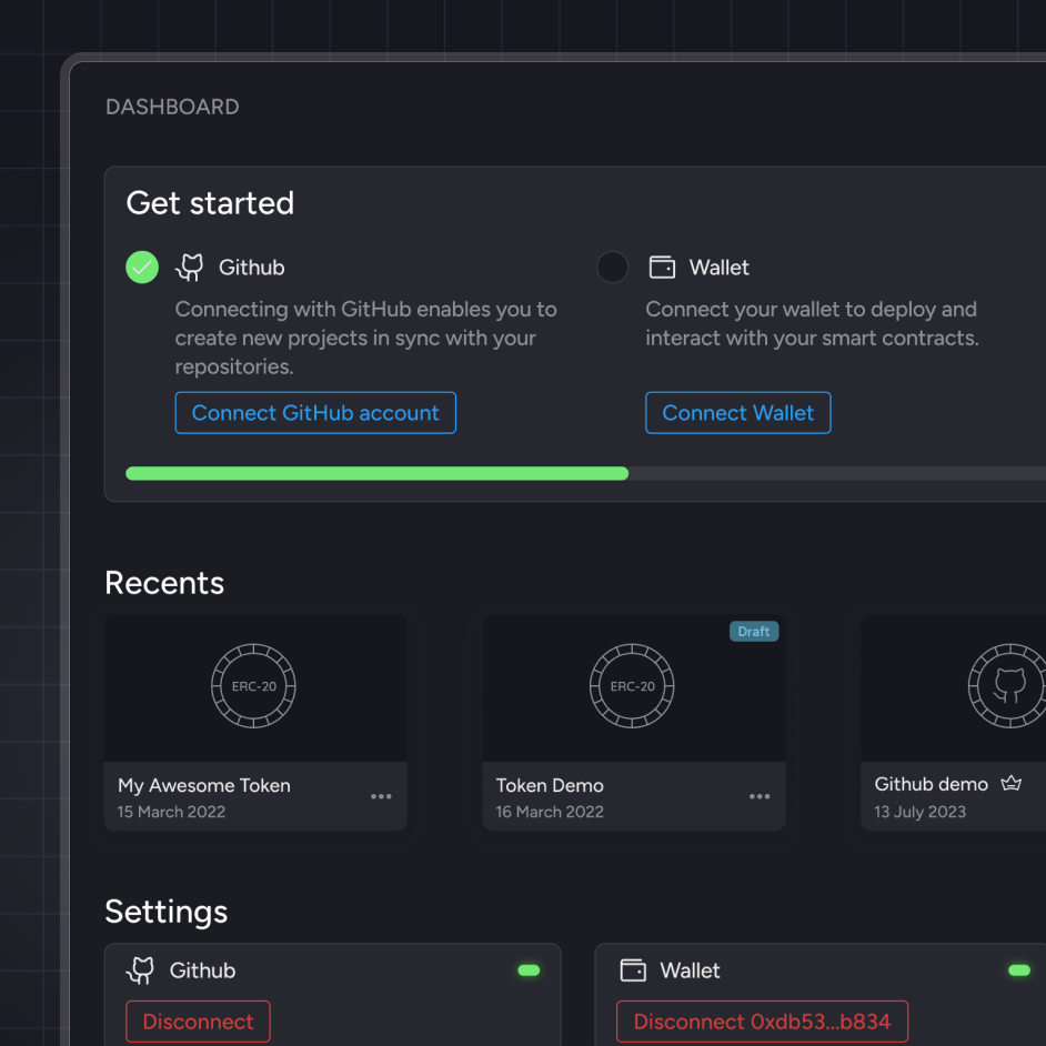
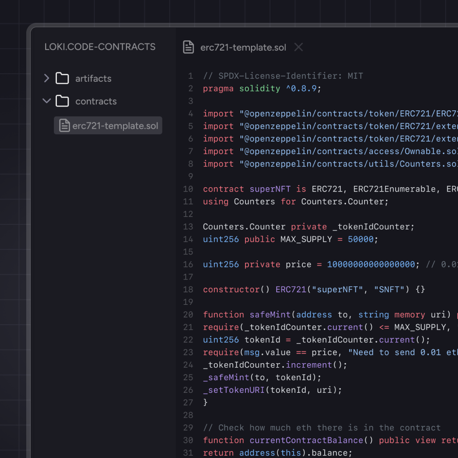
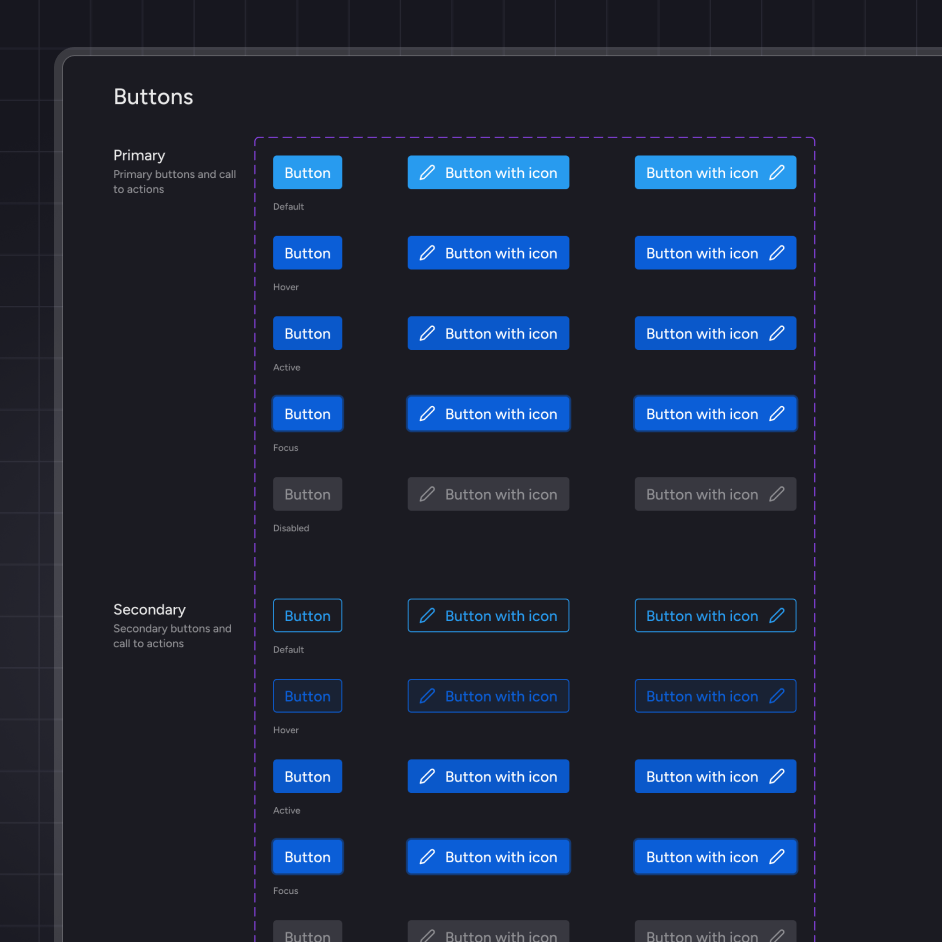
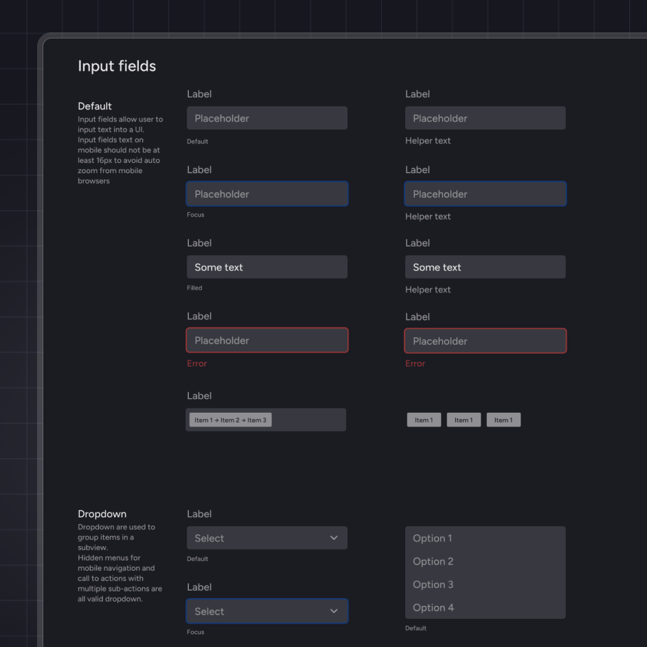
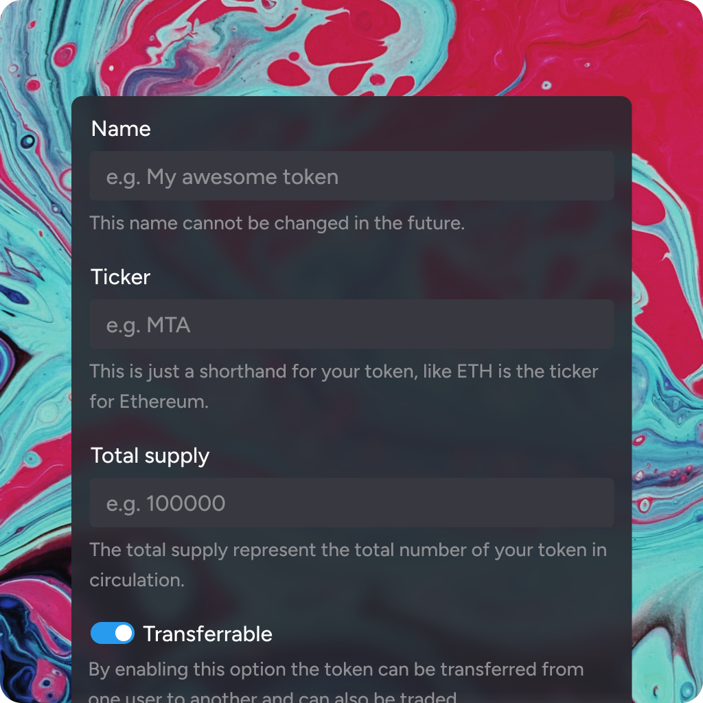
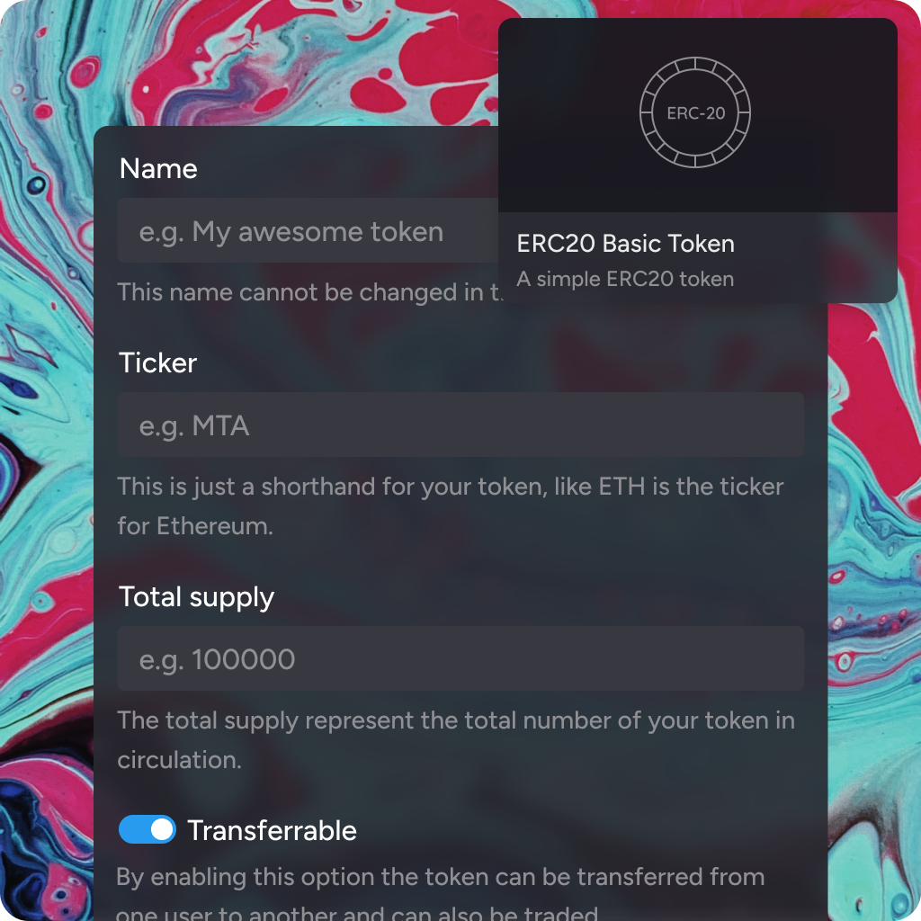
Designing the platform was a really straightforward experience, given the thorough research we carried out in the beginning, giving us a clear understading of the structure and information architecture. Starting out with some rough wireframes and sketches we were able to test some initial concepts using our contacts.
User testing
We started user testing as early as we had something to show even before we had coded anything. In the beginning most of our demoes were Figma prototype created to simulate the final result and collect feedback that we then fed back into the design workflow to improve user flow, experience and clarity overall. The actual development only began when we had a solid base that was battle tested with multiple users.
Iterations
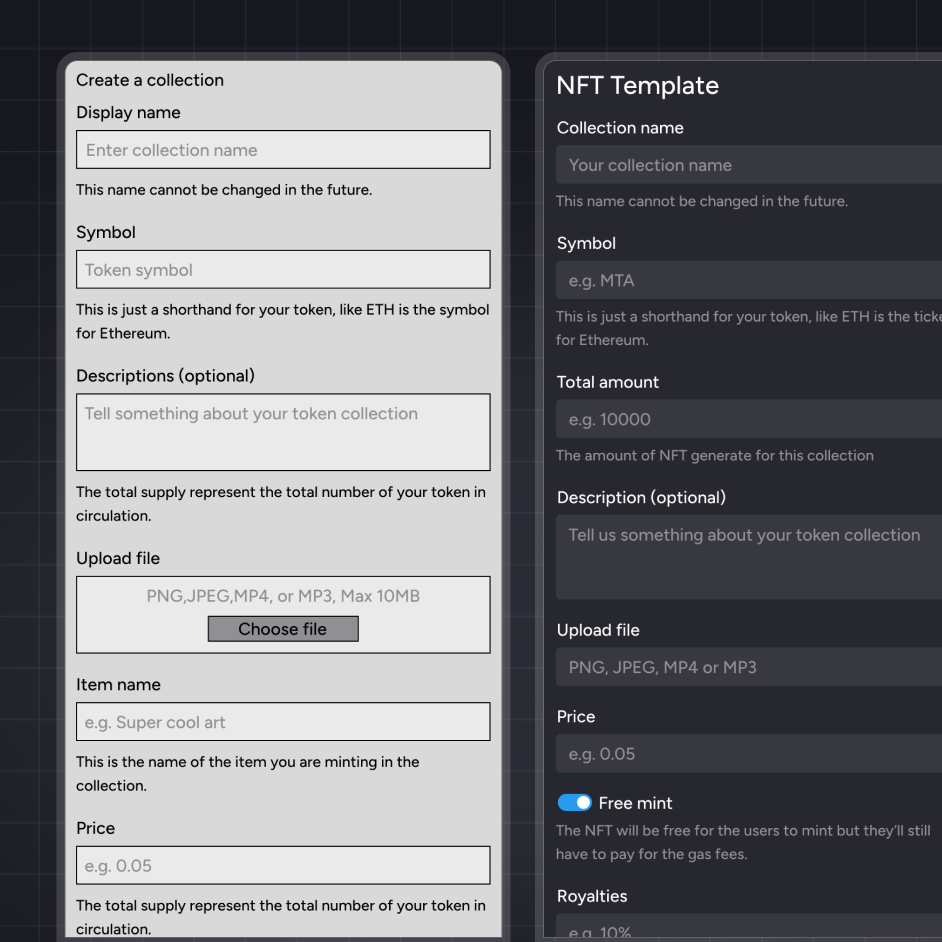
We iterated our designs multiple times over the course of a couple of months, adding new features where needed and fixing things that were not clear. Given the product being focused on developers we had to guarantee a great developer experience.
Brand identity
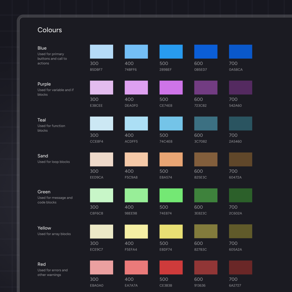
As part of my ongoing collaboration with Loki.code I was also tasked with creating the logo and taking care of the brand identity including designing pitch decks, presentation, banners, emails and more.

Loki.code 2021 - ongoing